CONTEXT:
The “Value” or “Non-Rewards” cards (internal designations) are typically called “Low APR Cards” or “Balance Transfer Cards” by customers. These Value cards do not receive ThankYou points or Merchant Offers, but they do receive access to a separate rewards hub called Citi Easy Deals. The cards are known for low fees/rates and long promotional offers, which attract customers, but then engagement dips after the promotional period has ended.
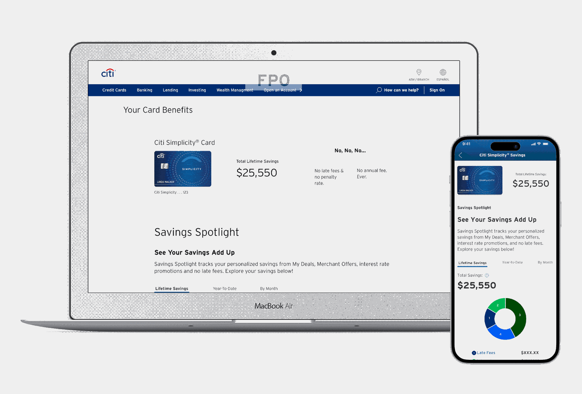
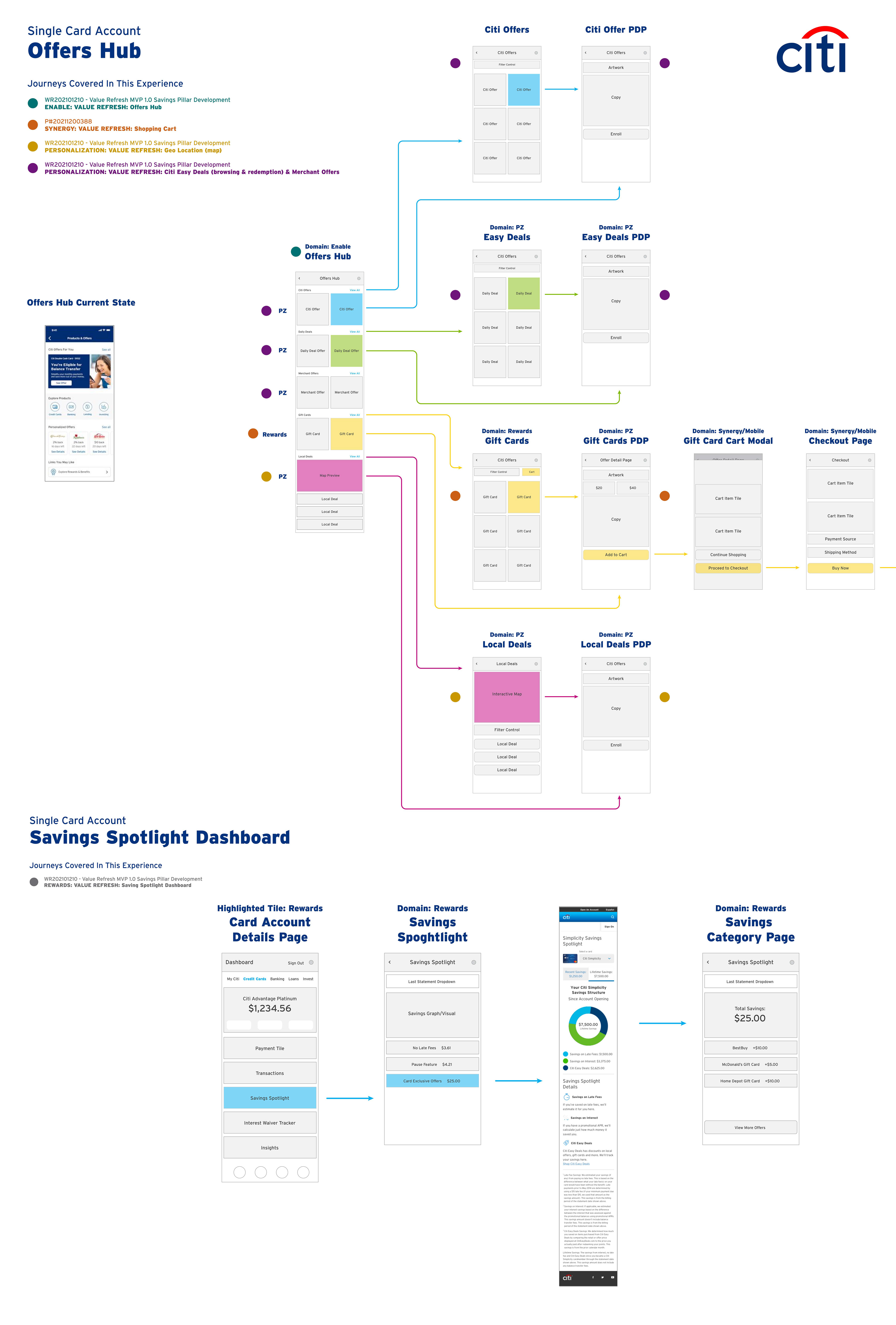
The Customer Journey begins inside the Offers Hub. The user will see their Savings Spotlight tile, this clickable tile will lead them into the Savings Spotlight Dashboard for either the Simplicity or Diamond Preferred card.
SOLUTION:
• Provide the customer with a broad view of insights relating to their Citi relationship
• Highlight savings driven by Citi with a comprehensive overview and transaction-specific view
• Prominently reinforce savings to remind customers of the value they are getting from Citi
• Opportunity to incorporate insights into the dashboard experience
• Leverage shallow nav and animation opportunities
• Provide customers with an overview of their “perks”
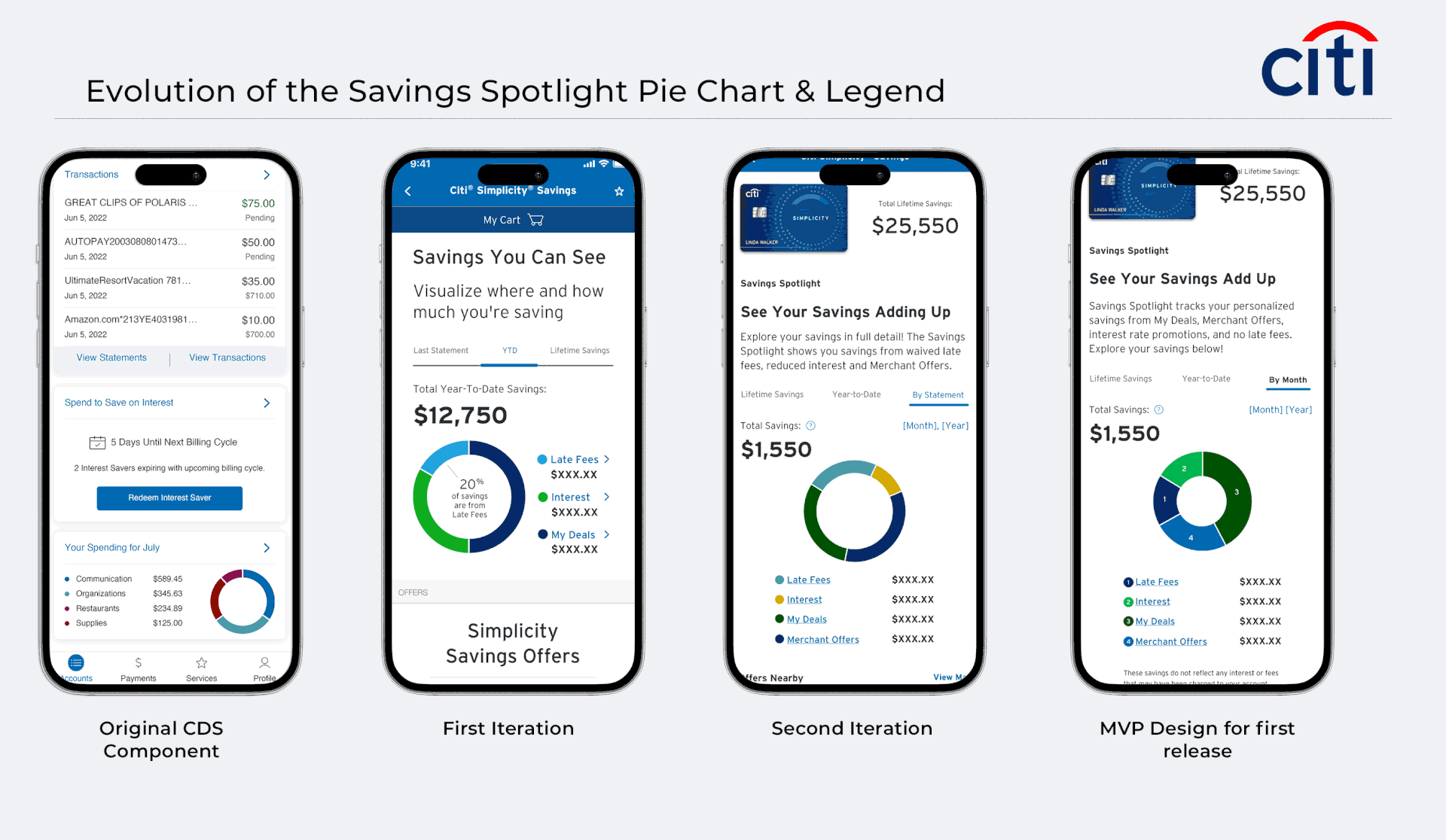
Since the Savings Spotlight is an existing product that we were improving, I began with high-fidelity wireframes of potential flows and ideas for the savings dashboard using existing CDS (Citi Design System) components.
UX/UI EXPLORATIONS:
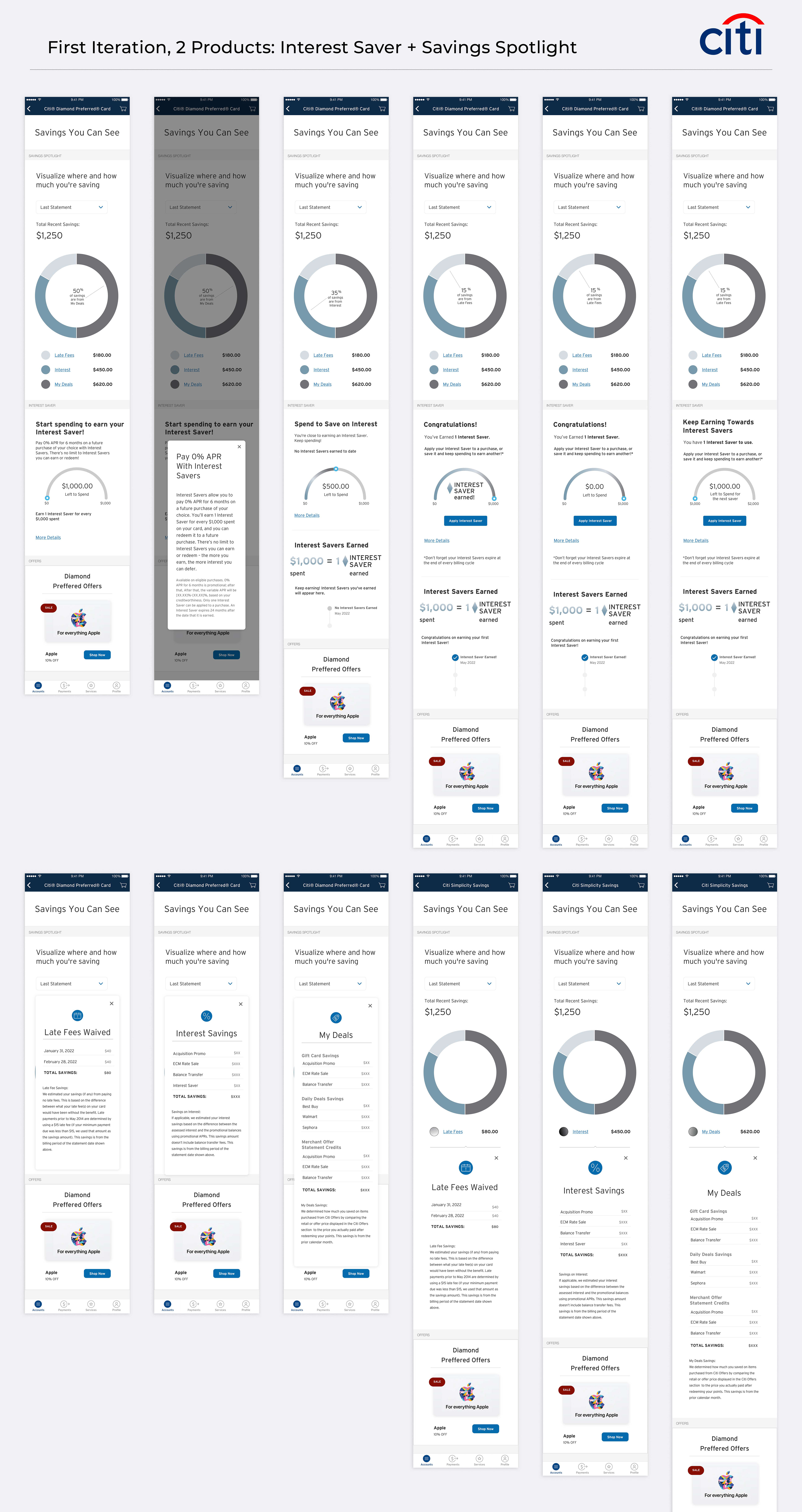
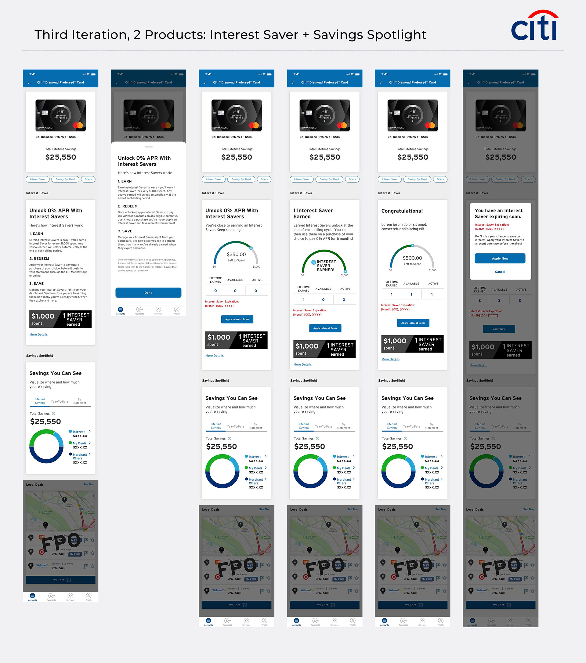
The requirements for this product changed with every iteration of the design and sprint phase. Initially, I was designing for 2 products, the "Savings Spotlight" and additionally the "Interest Saver" which was unique to the Diamond Preferred card.
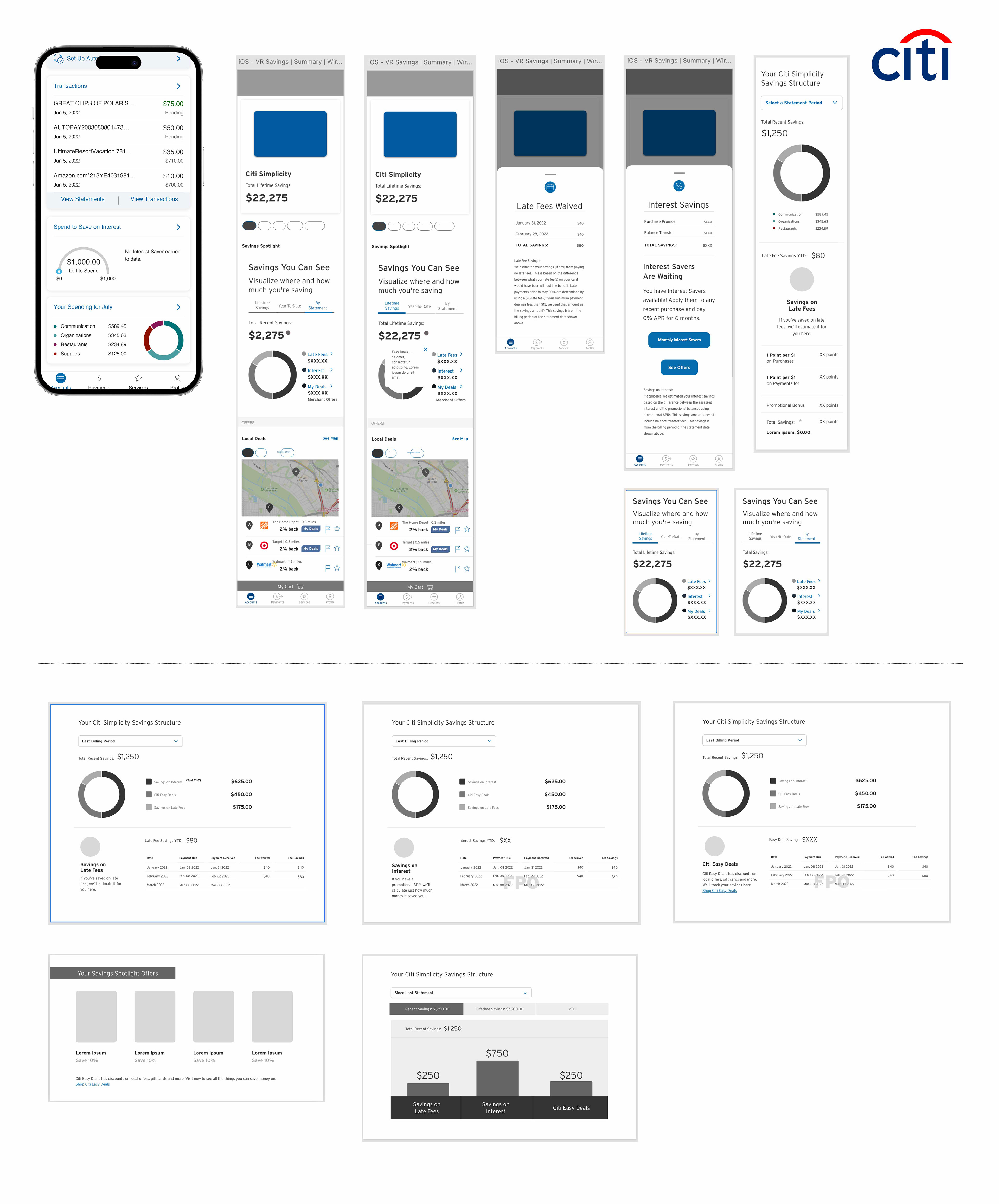
Below you will find 3 iterations of the same products but with varying business requirements in the savings data displayed. I took design cues from the Diamond Preferred card's brand guidelines to create visual reference to this brand since the "Interest Saver" was only for the Diamond Preferred customer.
INTEREST SAVER:
For the Diamond Preferred customer, Interest Savers can be earned for every $1,000 spent. Once earned, this "Interest Saver" is applied to newly posted unbilled purchases as having "zero earned interest" for 6 billing cycles.

VARYING REQUIREMENTS / USER TESTING RESULTS:
The Diamond Preferred Savings Dashboard initially displayed: Late Fees, Interest, and My Deals. 2nd Iteration it displayed: Interest Savings and My Deals, and in the 3rd Iteration it displayed: Interest, My Deals, and Merchant Offers.
The business required emphasis on the Interest Saver functionality for the Diamond Preferred card, which is why it appears first in the hierarchy of the composition. However, after preliminary user testing the business decided to remove the Interest Saver feature from the project requirements.
DESIGNING FOR ACCESSIBILITY:
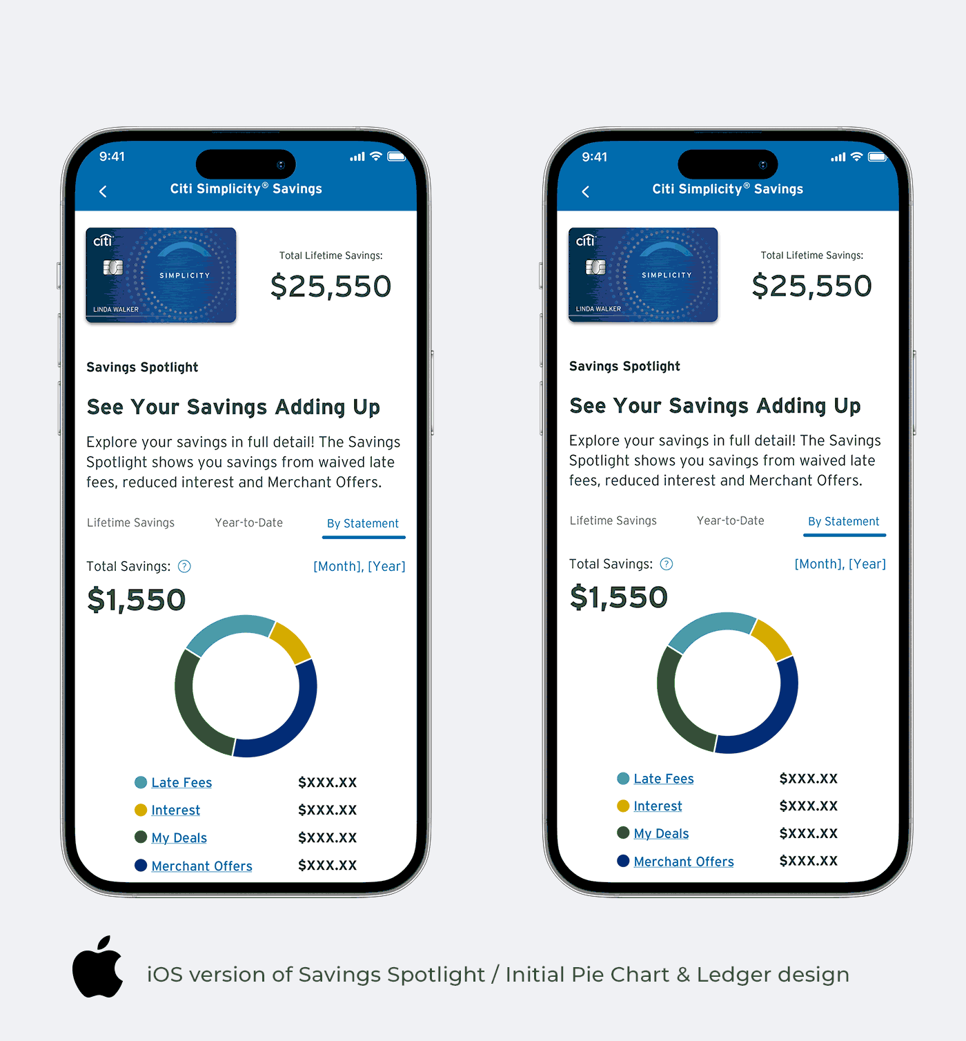
My designs were presented in 3 rounds of user testing. One key component of the experience of this savings dashboard was the interactive pie chart and ledger.
My team and I played with the idea of the user clicking/tapping on the pie chart to see their % of savings in the chart, and the coordinating ledger category would highlight. Then click/tap the ledger category to get more details of that category within a new screen in the drawer sliding up from the bottom of the screen. In the 3rd round of testing, users preferred to tap the pie chart and have a color-coded bar appear within the ledger categories.
After several rounds of preliminary user testing, and several sprints later it was brought to my attention that the unique pie chart design created for this product could not be read by screen readers for the blind. The ledger could be read in detail, but the actual pie chart would be read as an "interactive image" not a readable component.
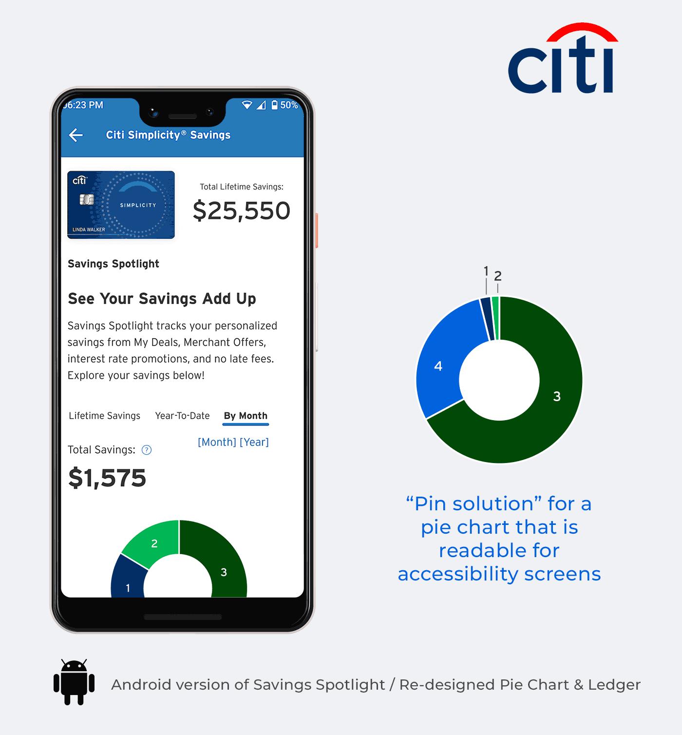
CRAFTING A NEW COMPONENT:
In designing a new pie chart that is accessible to screen readers we leveraged the spend summary graph from the CDS (Citi Design System) library for the Savings Spotlight infographic. Based on business requirements and user testing feedback we made a few modifications:
• Made the legend clickable to display details for the category
• Made the "donut" pie chart clickable to display details for the category
• Changed the colors in the legend to go with the branding of the card
After these initial changes, we were informed that the pie chart was not ADA compliant. My team and I collaborated with the CDS design team to create new versions of the pie chart, but we eventually had to solve the issue of the savings categories being too small to have text inside the pie chart pieces.
Our final solution for the MVP release was a pie chart that could adjust into smaller slices having numbers outside the pieces, but pointing to the slice that correlates to the category in the legend.